A shorter checkout, and a client area that works on a phone
Ordering hosting now takes four screens instead of six, the checkout asks only for what an invoice or a domain registry actually needs, and the client area has one design across desktop and phone, in English and Russian. Here is what changed and what didn't.
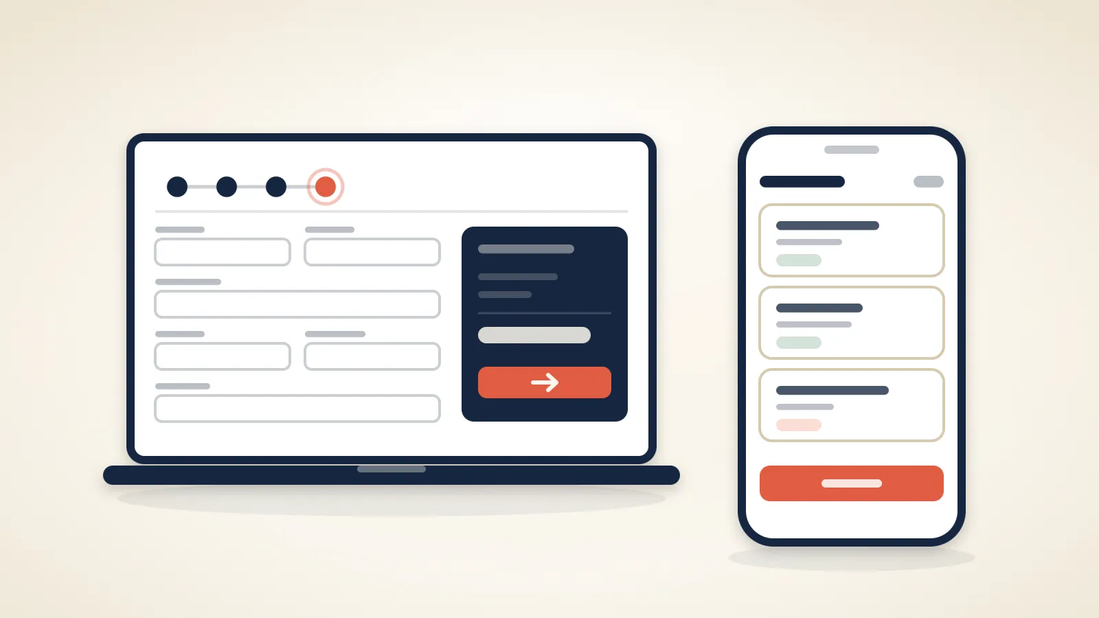
Two things changed at my.maxinodes.com over the past week: how you order, and what you see after you log in. Both were the stock look of the billing software with our colours painted on. Now they follow one set of rules.
Ordering: four screens instead of six#
Pick a plan, choose or bring a domain, review, pay. The billing cycle is chosen on the domain step, next to the plan you picked, rather than on a screen of its own. Two configuration screens that existed only because the software offered them are gone. Nothing you could buy before has been removed; you just aren't asked about it twice.
The checkout asks for less#
Name, email, address and a password. A phone number is required only when a domain is in the order, because registries insist on one. Company name sits behind a link for those who need it on the invoice. A state or province field appears only for countries that have them. If something is missing, the message shows under the field rather than at the top of the page, and your order total stays beside the form the whole way. Payment methods are listed by what they are; there are more of them now.
One client area, on any screen#
Buttons, cards, tables, menus and status labels now share one design with the checkout, in English and Russian alike. On a phone, tables turn into stacked cards instead of a sideways scroll, the menu was rebuilt with the account first and the marketing links last, and the cPanel management pages, where you handle email accounts and databases, can be worked with a thumb. Every page has a proper title, and the addresses are readable: the domain price list lives at /domain/pricing, not behind a query string.
Domains got their own landing: search for a new name, transfer one you already own, or open the price list per extension.
What did not change#
The software underneath is the same. No data moved, your login is the same, and nothing about your hosting was touched. If a page looks wrong on your phone, send us a screenshot; the phone work is the part most likely to have a corner we missed.
Related articles
New at Maxinodes: our own webmail, automatic payment and a new pay page
New in September: our own webmail at webmail.maxinodes.com, automatic payment for renewals, a new card payment page, and a client area that stays in your language.
Mailboxes on your own domain, included with every plan
Every Maxinodes hosting plan includes mailboxes on your own domain, with IMAP, POP3 and webmail, at no extra charge. Moving your existing mail in is free, and Microsoft 365 and Google Workspace stay available for teams that need shared calendars or Teams.
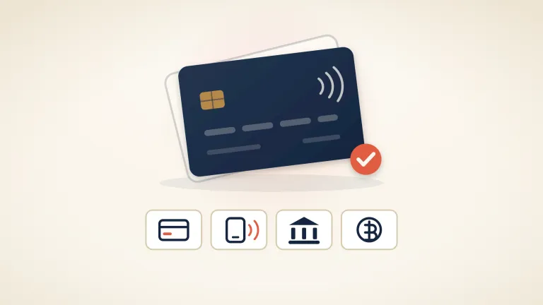
You can now pay by card, PayPal, iDEAL or SEPA
Until late August, cryptocurrency was the only way to pay us. Invoices now take debit and credit cards, Apple Pay and Google Pay, PayPal, iDEAL, Bancontact, SEPA Direct Debit and a plain EU bank transfer. Since 21 September, paying a new order by card saves the card with Whop, our payment provider, and turns on automatic payment of your renewals, which you can turn off at any time.